Carve Out Private Equity
Private Equity
Carve Out Private Equity specialises in private equity carve-outs, actively driving business transformation. They focus on turning companies into streamlined, agile operations ready for long-term success, going beyond traditional consulting.
Logo Design
Branding
Web Design
Graphic Design
Visual Identity
Creative Direction
.avif)
Carve Out required a complete identity from the ground up—including naming consultation, visual identity, and communication guidelines. The brand needed to balance authority and innovation, appealing to a sophisticated audience while standing out in a traditionally conservative market.
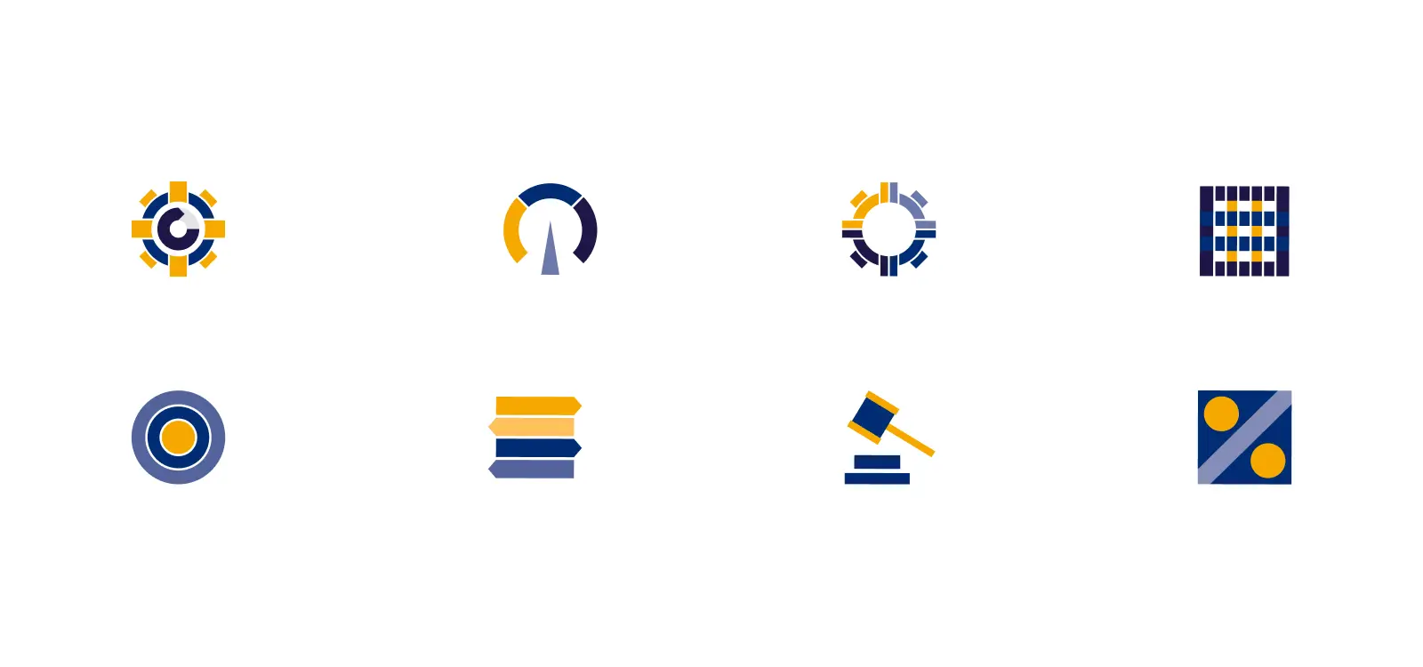
To establish a confident and credible presence for Carve Out, a full branding process was executed from the ground up. This included designing a modern, minimal logo that conveys strategic precision, along with a carefully selected color palette of navy, slate, and warm neutrals to evoke trust and professionalism. Typography choices were clean and contemporary, supporting the brand’s need for clarity and sophistication.

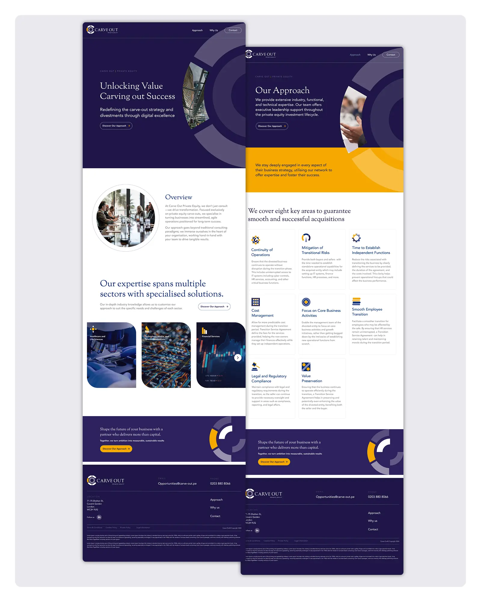
The visual identity was extended across a range of branded applications, including presentation templates, investor decks, marketing collateral, and website design concepts. This ensured a consistent and polished presence across all key touch-points, effectively positioning Carve Out as a bold new player in the private equity space.

The new identity positioned Carve Out as a confident and capable player from day one. The brand foundation has supported successful investor presentations, strategic outreach, and initial deal flow activity, establishing credibility and distinction in a complex marketplace.
Visit
Carve Out Private Equity
Website


.webp)
